
CLIENT/AGENCY
Cellarmasters - Endeavour Drinks Group
MY ROLE
Direct marketing concepts and print design
month/year
March 2016
tEam
Myself, Copywriter, Marketing manager
brief and objectives
- Design a direct marketing piece to promote Cellarmasters' wine offers
- Introduce new, loyal and inactive customers to an exclusive offer and drive them to purchase through one of two methods - online or by phone.
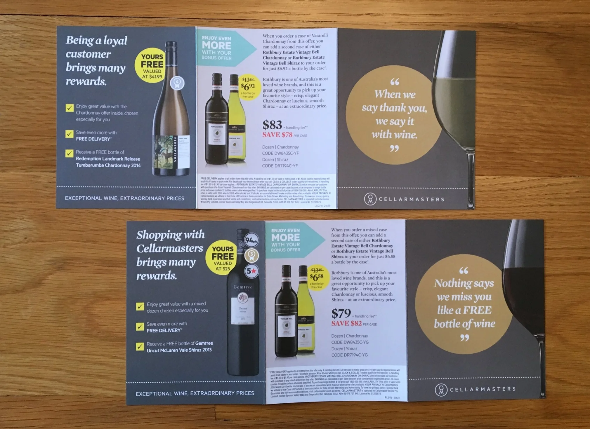
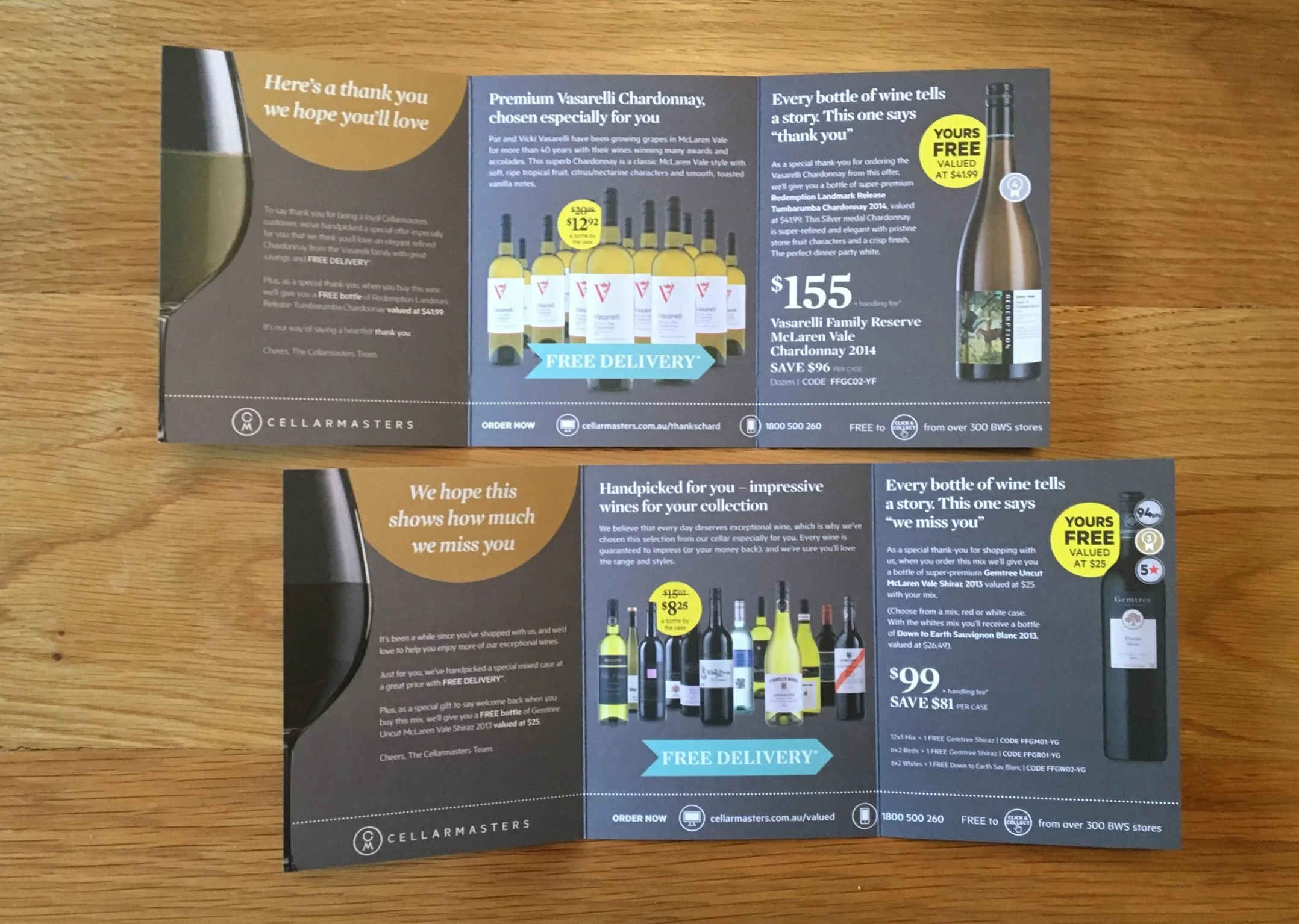
- Produce eight versions of this for targeting different customer segments. New customers, Risk/ inactive customers are to be sent a mixed case offer.
- Loyal customers were to be sent a single variety case offer (Shiraz, Sav Blanc or Chardonnay) dependent on their preferences at one of two price tiers dependent on their spending history.
- The core business objective of this print campaign is to drive interest to potential, loyal and inactive buyers to Cellarmasters with a different product offering that is competitive.

DESIGN PROCESS AND RATIONALE
- This process began with a collaboration and briefing meeting the marketing manager, myself and the copywriter assigned to the project to discuss deadlines and deliverables.
- This campaign had proved highly successful last year so I used the previous year's designs as a starting point for my sketches, considering various options for each side.
- I created mock ups to help establish the logic of each side and if the content flowed correctly and seamlessly in the trifold. These needed to be done for all 8 versions.
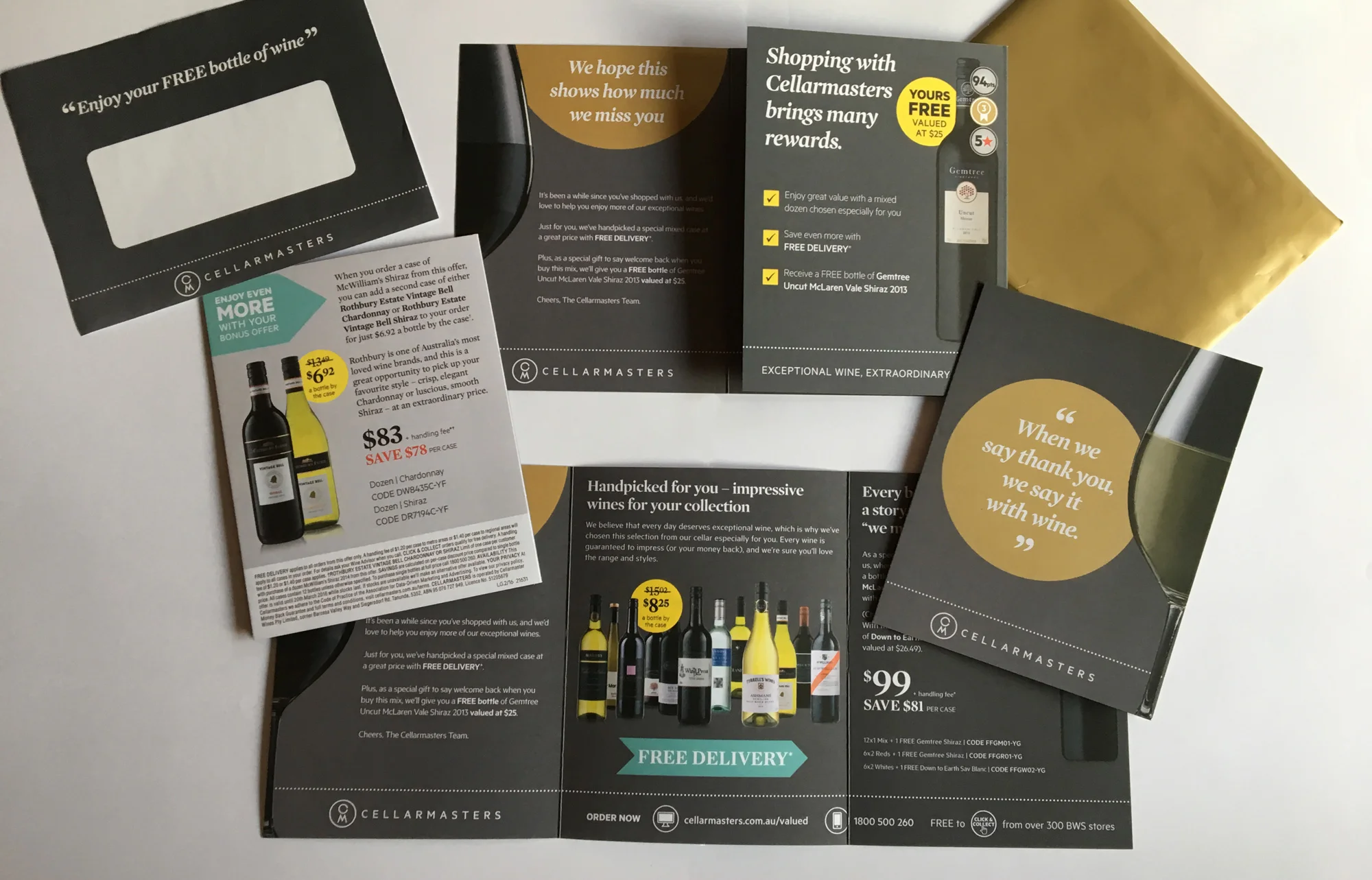
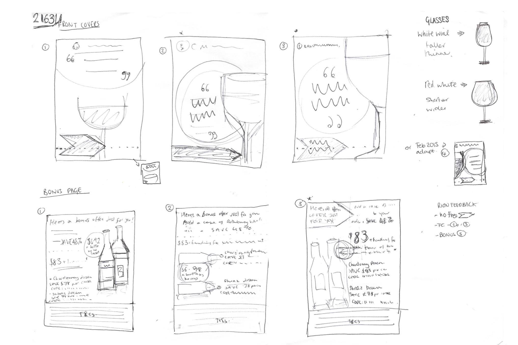
- The marketers wanted to make this piece stand out and be a little bit special, particularly to those who were inactive customers, sending them marketing material by post was a different way to reach out to them. Instead of the yellow circle normally used in the Cellarmasters campaigns, this one used a gold circle with accompanying gold envelope to convey an exclusive and premium feel.


KEY CONSIDERATIONS and challenges
- In the previous year's version a letter design had been used as the opening letter but as there was no longer a spokesman for Cellarmasters, the years would be addressed from the team so letter format did not work.
- On the front cover, dependent on the customer's preference (if known) of red or white wine, the glass shape would change! This meant considering carefully the layout of the headline.
- The inner page needed slightly less wide than the other two so that it would fold neatly.
- With 8 different versions, it required meticulous checking by myself and the copywriter! We printed them all out, studying each closely and against its; segment criteria (see image below).

OUTCOME AND RESULTS
- Final designs were sent to printers and I am very proud of this work.
- Once back from the printers, these were checked again and I received my own copies to keep.